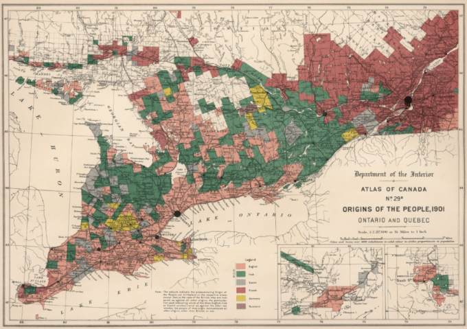
From the 1901 Atlas of Canada comes this map of Ontario and adjacent Quebec.

A high-resolution version from the David Rumsey Map Collection with a transparency slider to a current map is available here.
The colours indicate the predominant origin, not the birthplace, except in the case of the British, whether the English, Irish or Scotch predominate. Would DNA analysis show the same pattern?


This is cool, to see where the immigrants settled in Ontario and Quebec at that time.
Thanks John
Fascinating! Thank you!
Quite fascinating…I wonder where they got the information – the census? I note no English in the Ottawa area, all Irish…seems a bit odd to me.
I’m a bit confused by this map. No techie here. I am assuming that the Quebec colour means French-speaking. Green is Irish, pink is English and white Scottish? That sort of fits with my family history.
The Green in Niagara is along the Welland Canal which was full of Irish workers, so that was my strategy to try to figure it out. Any help out there from others, would be appreciated.
The map key for the colours can be found at the bottom centre of the image. From my understanding of reading the key, the colours only show the predominant origin for that area. So if a specific place was 30% Irish, 29% French, 21% English, 15% Scottish, and 5% of the others , then the colour would be green for Irish. It could be using the database from the 1901 Census of Canada and the Racial Origin column. If that is the case, then if a person was born in England, their father was born in Ireland, and mother born in Scotland, the origin would probably have been recorded as Irish.
For those interested in this map and many others produced from statistical data from that time, the source is the Atlas of Canada published in 1906 by the Canadian Department of the Interior. A “flip book” version can be found on the Natural Resources Canada site at https://atlas.gc.ca/flip/1906_Atlas/index-h5.html.